Meet
Next-Generation
AI-Powered
Travel Booking
Role
User Experience Designer
Duration
Jan - May 2024
Responsibilities
Business to Business design,
User Research/Validation,
Vision development
Team
1 UX Designer, 1 Programmer,
1 Product Manager
Overview.
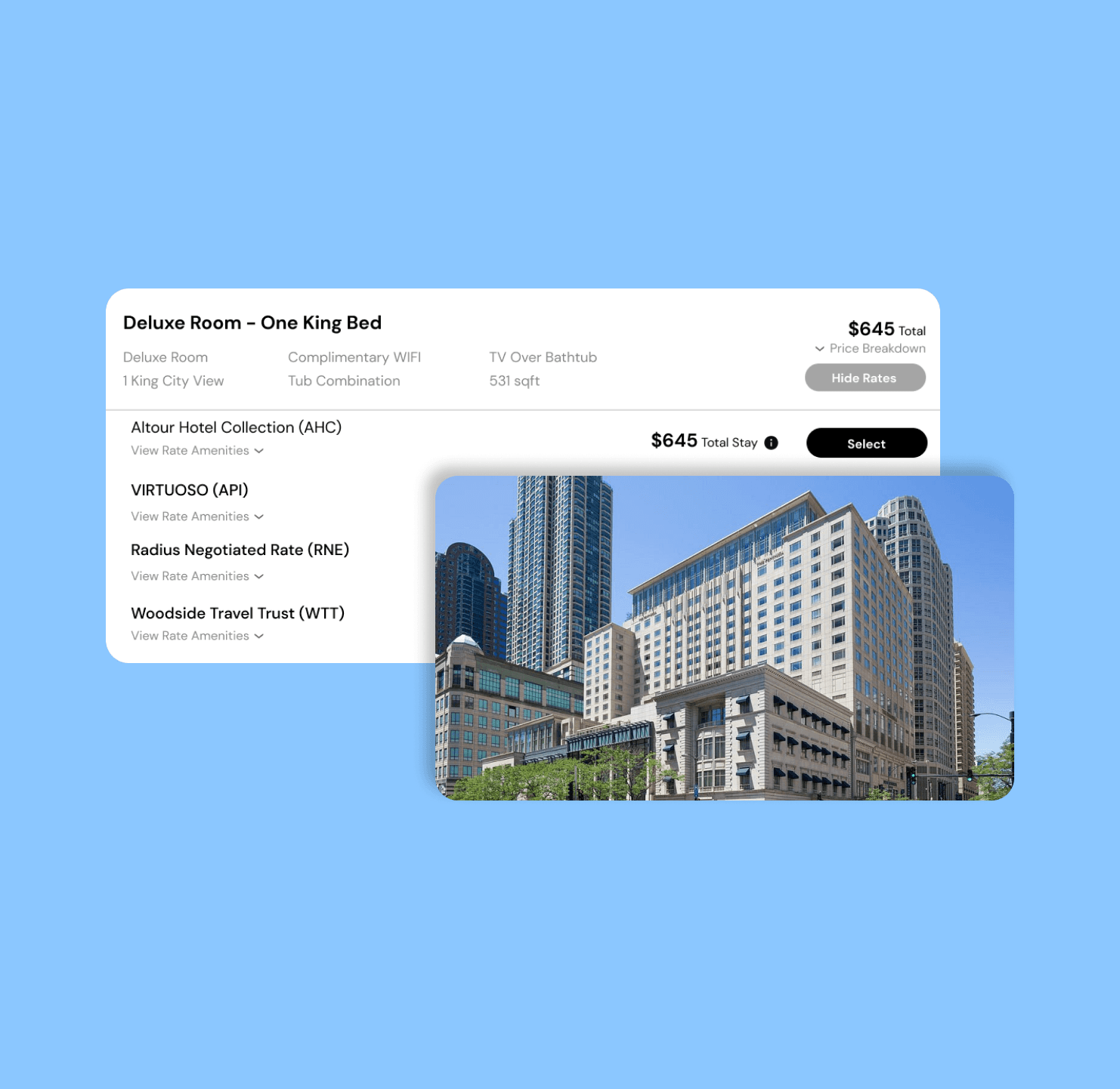
In January 2024, I joined TravelWits as a UX Design Intern. My primary responsibility is to enhance the hotel booking user flow and develop user interfaces for both the web search engine and mobile display. I focused on refining the information hierarchy and optimizing the sorting methods during the room and rate search process.
My work basically reduced the time consumption for the customers of the platform. Being tested, the page expansion size and crowded information in the room selection page has been reduced by 75%, and the average information searching time could be reduced by more than 32%. The implementation of my design is scheduled to begin in Q3 2024.
I will continue my position at TravelWits in the upcoming fall and spring to further enhance the connectivity of the hotel booking page with other website sections, as well as testing and deploying the web prototype.
About TravelWits.
TravelWits is an AI-powered one-stop search and booking tool for travel agencies and advisors. It connects to personal websites of agencies and provide a better searching and booking experience. It allows agencies to use AI-powered chatbot to search and book customized travel packages.
Design Challenge.
'Too many of our agents (clients) report that the current engine takes too long to locate and select one or more hotel rooms. Additionally, sorting information in an ideal way is difficult.'
During the initial stage of the design process, Arman, the CEO, shared this key concern. These limitations continue to cause confusion among agents who rely on TravelWits as their primary source for rate research, particularly due to the engine's accessibility to multiple rates.
Start with Research.
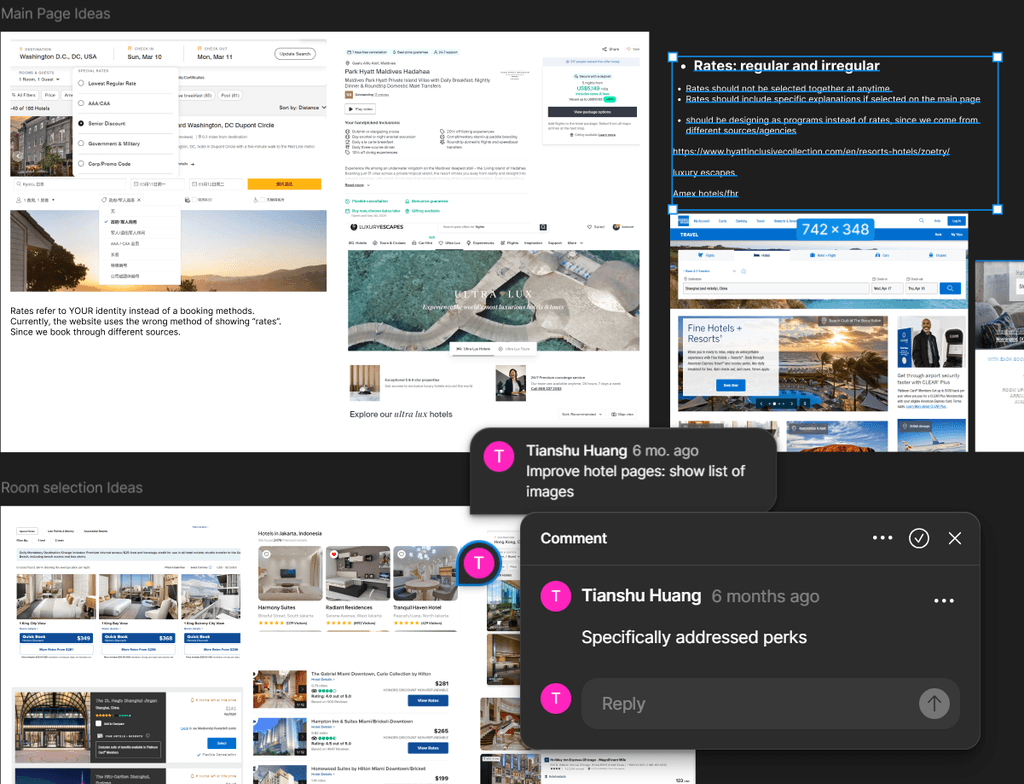
In order to determine the current problems clearly. I conducted a series of design audit and comparative analysis towards the current searching engine. I analyzed the similarities and differences between our product and the prominent booking websites in the market.
Problem Space.
Problem Space.
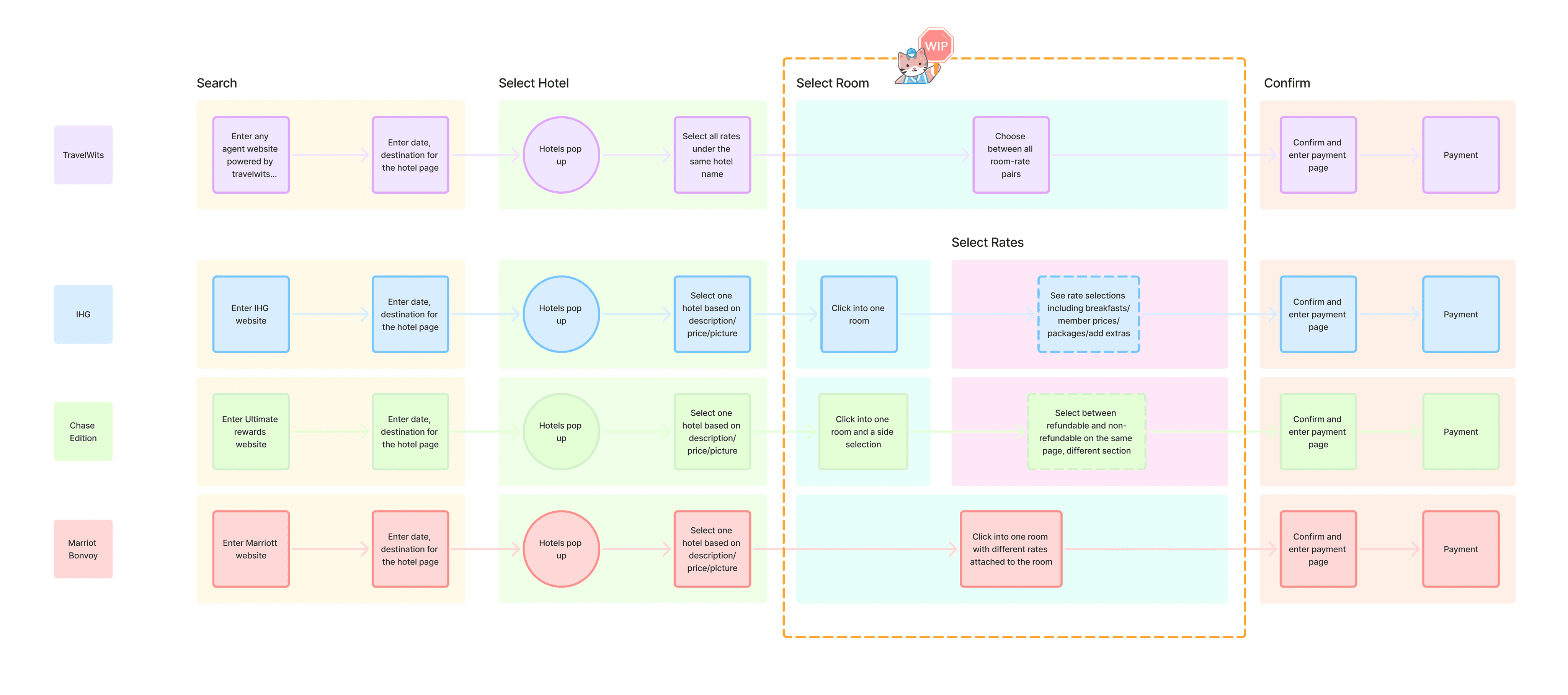
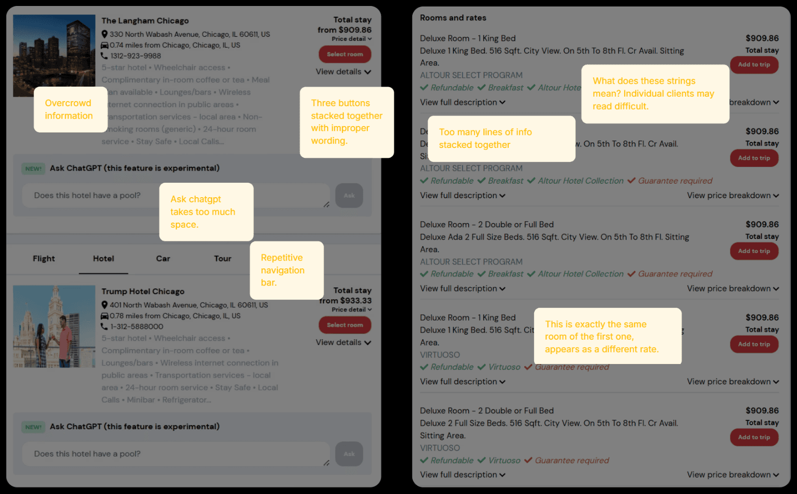
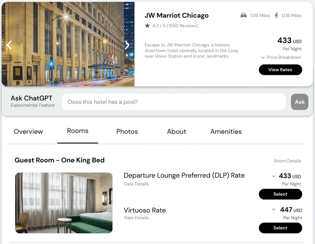
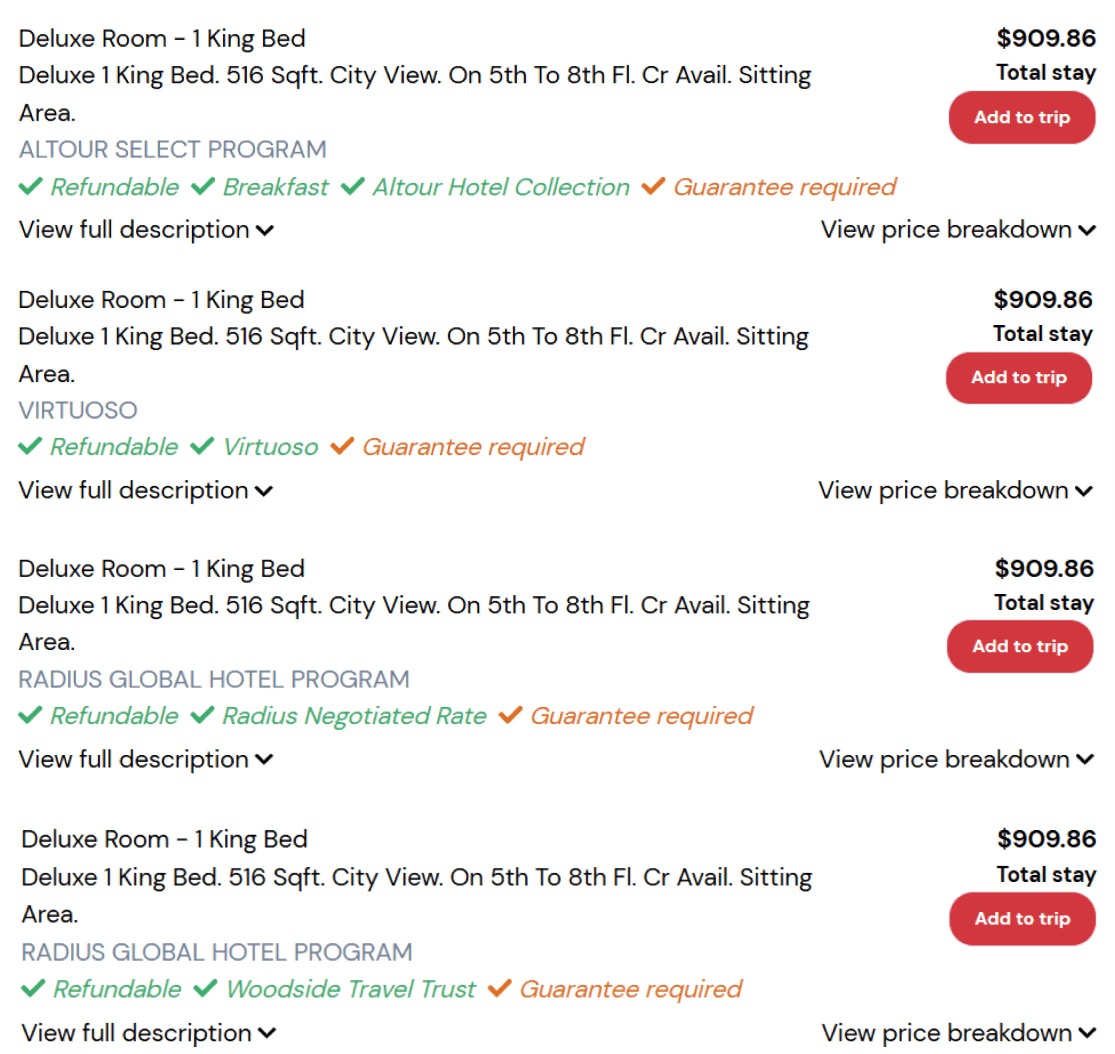
Compared with other prominent hotel booking websites in the market, TravelWits simplified the process of multi-rate selection page by stacking all selections in the same page. The tradeoff, however, is overwhelmed amount of information tabs during the room-rate selection.
To validate this current design and better determine the potential improvement fields, I conducted a user validation session with 8 frequently travelers who use travel agent websites and hotel websites to book their trips. They all had no experience with TravelWits before.
User Validation.
User Validation
User Validation
Prioritized Areas.
After the user validation session and discussion with the project manager, I proposed several design goals that leads to future changes of the TravelWits engine:
Avoid visual confusion created by the overwhelming rate tabs during booking.
Improve overall satisfaction of searching by refining the organization of information.
Enhance the client engagement by reducing the time of use when locating specific information.
Organize the options.
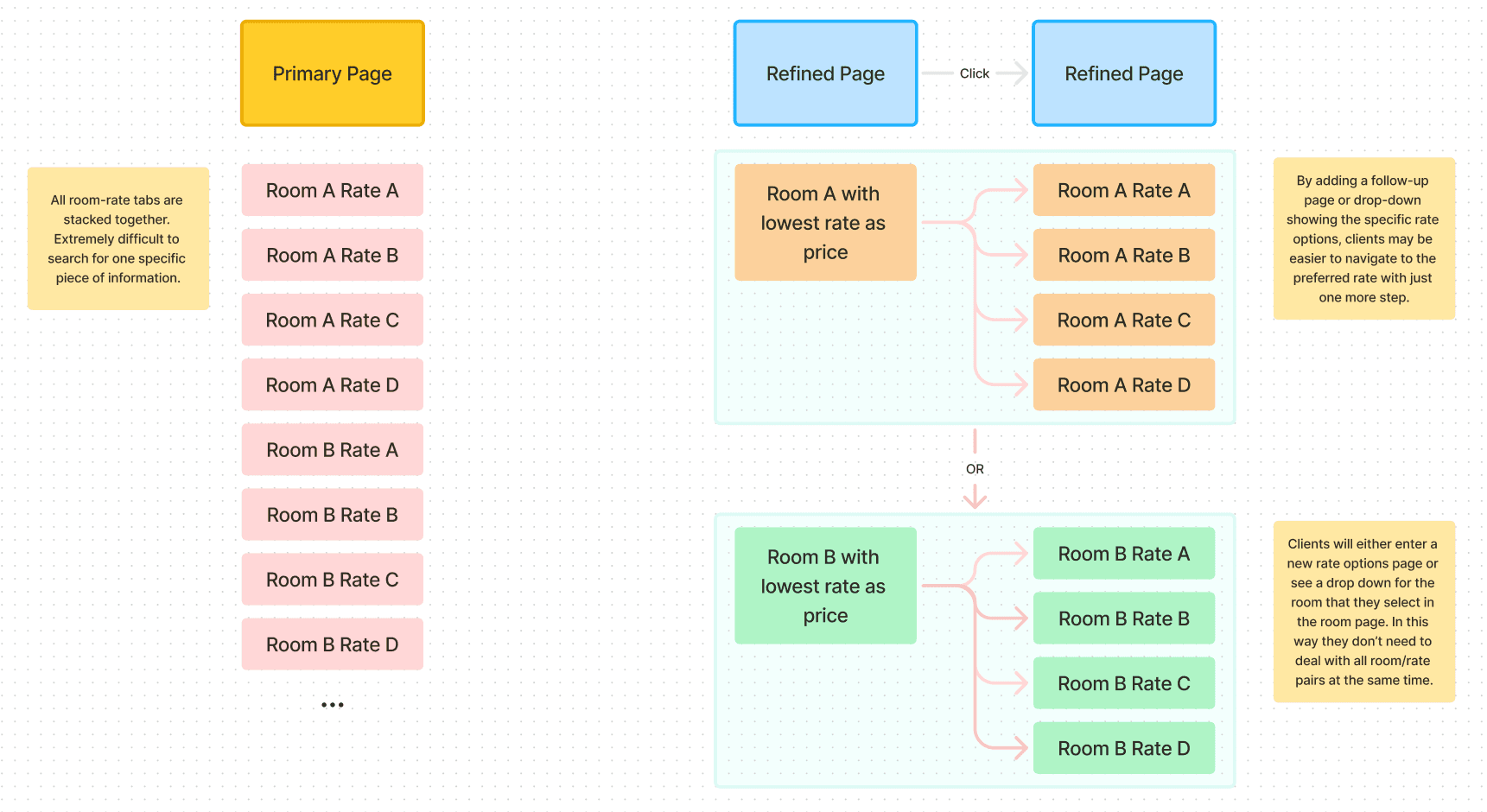
In order to better organize the rate options for our clients, I added a separate webpage interface that classifies the different rates under the same room name into one "room selection".
As a result, clients will spend less time searching for a room-rate combination that might hide in the very end of the page, thus having higher efficiency of their workflow.
Current Product: Will there be a thousand rates one day?
Design Iterations.
Center idea determined. How can I address a specific design solution towards this challenge?
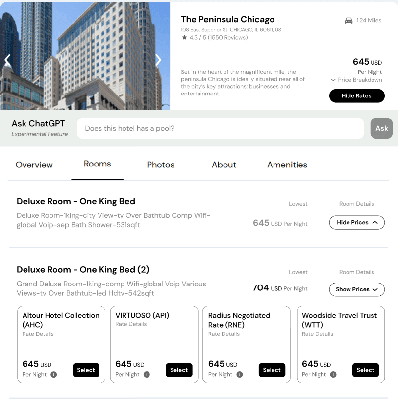
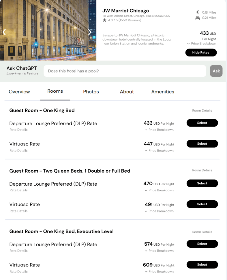
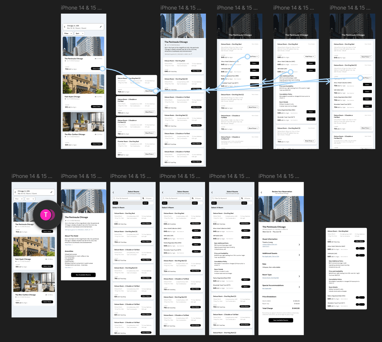
By first mapping out 3 possible information architectures, I prototyped 3 potential solutions, all of them ensuring a smooth and clear display of the rate information under one room category.
Final Solution.
After the parallel iteration has been finished, I conducted another testing session on these iterations to determine the final design.
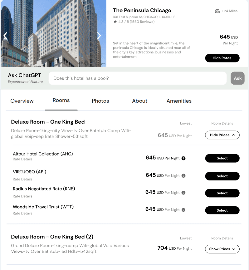
A final design with rate options expanding after clicking in the "show rates buttons" was made to use. This design turns out a high efficiency of booking by reducing 75% visual clustered information with only 1 more click without loading a new page.
Refined workflow solves the problem of overwhelming rate tabs.
How did this interface came out?
A thorough design audit was conducted during the same time as I proposed the refinement for the previous design question.
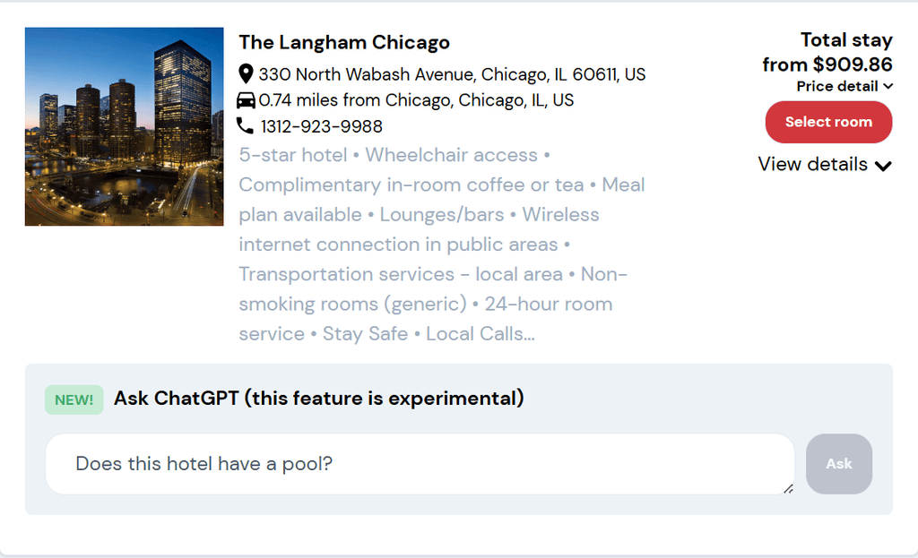
The current design of the hotel description and room rate tabs are too "fat". Overwhelmed information including repetitive hotel feature descriptions and confusing wordings took too much place.
Design Reference.
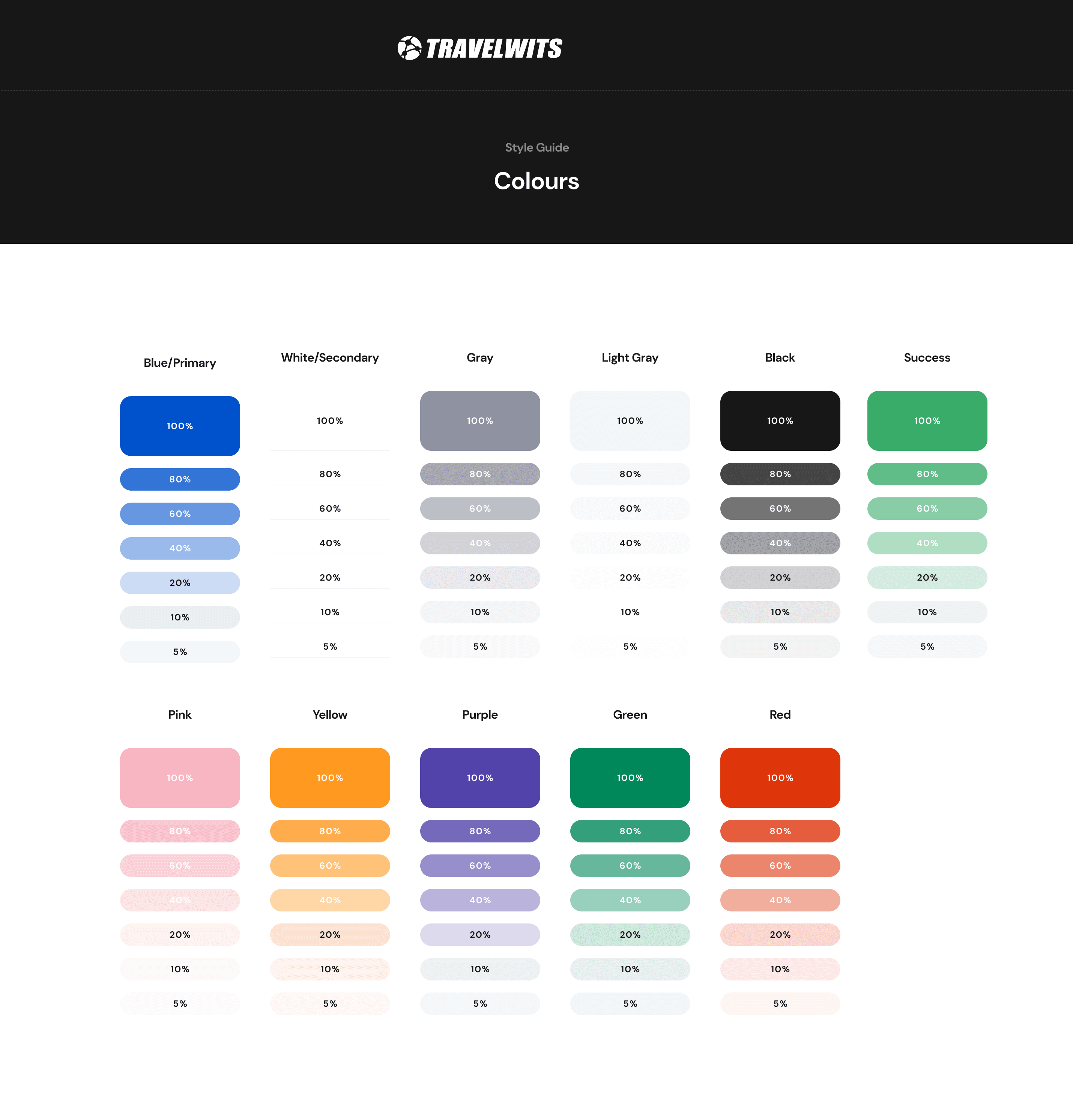
A color code section was provided by the design team at TravelWits.
Initial Iteration.
Early Ideations was made based on precedent research of prominent hotel booking website, including Marriot, IHG, Amex Travel, etc.
These primitives allowed me to play with and try to arrange information demanded by the users, simplifing the key pain points mentioned above.
Regrettably, technical constraints with the interface were encountered. The method that the website obtains information from the server makes integrating room images and details to the site a lot more difficult than expected. I was required to operate under the premise that only unprocessed server data could be utilized, without the availability of room descriptions or photos.
Design Solutions
The hotel information display tab is the first element to be refined. The information was too overwhelmed, and the attributes are generally repetitive between hotels — which luxury hotel does not have public WIFI?
The revised information tab eliminates the repetitive information, including hotel amenities and select buttons.
1
The room selection tab was redesigned with a minimalist approach, reducing the amount of displayed information. Throughout the design process, several iterations were developed. A key breakthrough in the information retrieval method allowed the website to automatically convert the 'room description string' from the first two iterations into keywords. This enhancement greatly supported the final design.
2

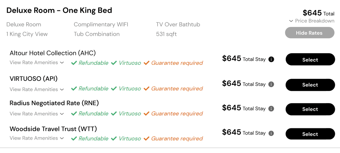
Previously, there was no classification method for room rates, leading to an overwhelming amount of information when an agent expanded a 'hotel room' option.
I addressed this issue by introducing a dropdown menu that appears when agents select the 'view rates' button. This design reduced the number of information tabs by 75% and eliminated 60% of repetitive information during the rate selection process.
3
By clicking the "View 4 Rates" button, agents can start rate selection inside a specific room choice instead of dealing with an unarranged rate-room paired info tab.
Not Enough? Filter as a further approach.
Besides a clearer interface with reduced visual load, a filter during searching rates was also designed and applied. clients then might be able to select rooms within specific features and narrow down the room/rate searching domain.
Expandable Information Hierarchy.
Not everything was deleted from the existing UI. The room and rate description can still be expanded from the rate tab offered when the room has been selected. However, the hierarchy became clearer as an advantage of the enhanced booking workflow.
I will continue my role as a UX designer at TravelWits, primarily focusing on developing the mobile interface and adaptability of the hotel webpage in multiple booking scenarios in Q4, 2024. Other case studies will become available soon!
Takeaways.
Technical Constraints are always in first place.
The biggest thing that I had learnt through designing in TravelWits is that a UX designer should always calm down and "listen to" the project constraints, including programming capabilities, information servers, resources, and any other thing that may influence anything in the design process. One key point in my progress was the information retrieved from the server: we just don't have room descriptions due to OTA protocols with the hotels, also everything from the server will be returned in plain strings. How's this information important? At least I should not spend an amount of time doing the room description interfaces and try to make those wordings super fancy. Design is easy but making a product is not, thus designers need to acommondate.
Design is a process of avoiding opportunity costs. That's the main idea.
When presenting my idea of "add another click and make the previous page looks not that loaded", Arman (the CEO) asked me if this "decrease in information amount" is worth an extra click. Of course, yes here. But it led me to a deeper thinking: what about when only 10% of information will be reduced by an extra click? What about 5%? I realized that design is a process of making a series of decisions. To really know the answer for this kind of questions, we need to do extra amount of user studies and research. Do the agents really care the 10% reduction in information? In other words, which one gives them a higher efficiency. We need to conduct further A/B tests with users to realize the answer.
